Artist
Porto Rocha Rebuilds Almeida & Dale’s Visual Identity for a Global Stage
New York studio Porto Rocha designs a custom Diakritik AD typeface and singular blue system for São Paulo gallery Almeida & Dale after its 2025 Millan merger.
By Unjica Editorial
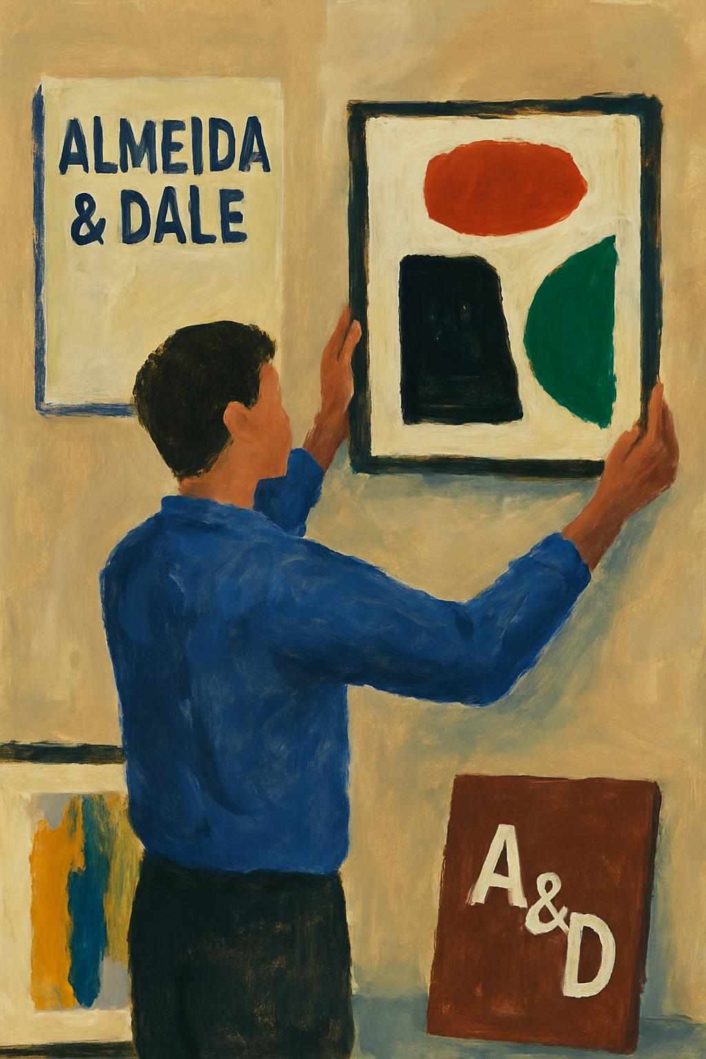
New York studio **Porto Rocha**—helmed by Brazilian designers Felipe Rocha and Leo Porto—has delivered a new visual identity for São Paulo gallery **Almeida & Dale**. The studio’s case study states that after a 2025 merger with Millan (est. 1986), the gallery operates across three Brazilian locations, with a new São Paulo flagship planned for 2026, yet its prior brand still read as “corporate and transactional.”
The system centers on **Diakritik AD**, a custom typeface designed with Marek Nedelka: mid-century condensed proportions engineered for Brazilian Portuguese, with diacritics drawn at the same weight as the letterforms. Secondary face **Bull-5** borrows typewriter-label texture from 1980s newspaper archives. A singular blue breaks from blue-chip black-and-white neutrality; layouts privilege full-bleed artwork, dynamic grids, and motion across catalogues, fair materials, and signage.
BP&O’s coverage likewise frames the project as giving Almeida & Dale international stage presence without erasing Brazilian specificity—identity as editorial infrastructure rather than logo polish. Founded in 1998, the gallery’s programme champions modern and contemporary Brazilian artists including Lygia Clark, Tarsila do Amaral, and José Leonilson.
contemporary artexhibitionartistvisual identityAlmeida & Dale
Sources
Unjica did not independently report this story. The details above summarize published reporting and are attributed to the original sources.
- Porto Rochaportorocha.com
- BP&Obpando.org
About the author
Unjica Editorial
Curated art news and analysis from the Unjica editorial team.
Reader response
Comments (0)
Share your thoughts on this piece. Thoughtful, art-focused discussion is welcome.
A
No comments yet. Be the first to respond to this artwork.